

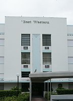
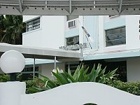
| Now part of the Best Western complex, this building was originally the Kenmore Hotel. (Note that the sign is still partly visible behind the canopy extension. See below.) See also the Taft Hotel and the Davis Hotel. | ||
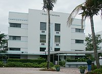
Front facadeLike many Art Deco structures, it is symmetrical with a tripartite design--on the side as well as the front. The central bay has subdued vertical decoration--a kind of fluting design, while the window on the corners are recessed. (More typical in Miami Beach are windows with eyebrows, a variation on the "brise-soleil," also a way of shading the sun.) |
|
|
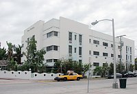
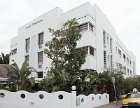
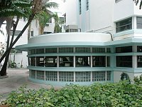
Oblique views and the partially obscured original signThe three-part design continues on the long side facade as well. Like many Miami Beach art deco hotels, this one has few stories, although it still has a kind of monumentality when seen from the side. | ||
|
|
|
|
|
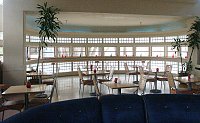
The one-story curved extensionGlass brick and ribbon windows provide a lighted space for this breakfast dining room. |
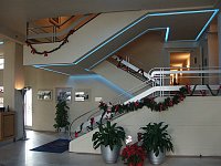
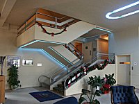
The neon-emphasized stairwayWe stayed at this hotel in January. I couldn't prevail on the management to take down the Christmas decorations. The metal railings have a kind of ocean-liner look--not uncommon in other Miami Beach hotels of this era. |
|
|
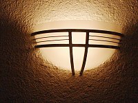
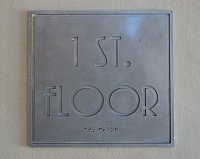
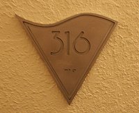
Art Deco detailsWhile the signage is no doubt recent (with the braille symbols), it is probably similar to the original. | ||
|
|
|
 Click here to return to index of art historical sites.
 Click here to return to index of artists and architects.
 Click here to return to chronological index.
 Click here to see the home page of Bluffton University.

