Sometimes called the father of Post-Modern art, Robert Venturi challenged the prevailing modernism and Mies's dictum that less is more. (For Venturi, less was a bore.) He and Denise Scott Brown championed the vernacular, saying that "Main Street is almost all right," and saw the possibilities in the commonplace--or in making the common, uncommon. At about the same time as Pop Art in painting and in sculpture--which often used ordinary objects or mass-market images, their architecture embraced the ordinary. In addition, they argued for an architecture of complexity, contradiction, ambiguities, and paradoxes--as opposed to the simple elegance of the best modern architecture.
|
|
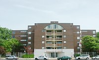
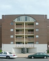
Front facadeThis apartment building for low-income elderly housing was one of the first important works by Robert Venturi and his partner then, John Rauch. (In 1967 his wife Denise Scott Brown joined the firm, since called Venturi Scott Brown.) Like an ordinary structure, this front respects the street line of the city's grid, although the building is recessed on both sides. Like an ordinary structure in this neighborhood, it has a rather cheap-looking facade of red brick. Many of the windows are conventional double-hung metal windows. Thus, in many ways this building is ordinary--some say even ugly. In addition, it is contextual, relating to the architecture of the neighborhood. |
| |
|
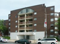
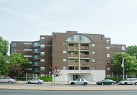
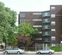
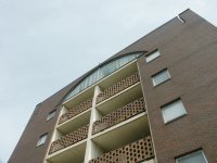
Six-story entrance facade and stepped back sidesThe entrance has a white brick "base" and the fenestration terminates in an arched window--illuminating the common room on this top floor (not relegated to the basement!). Missing is the original gold anodized aluminum television antenna on the roof above the central bay, which presumably referred to the primary preoccupation of the elderly residents. The stepped-back sides allow for more windows with sunny exposures. |
|
|
|
| |
|
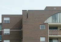
Uncommon detailsLike the screen facades on some medieval cathedrals, this front deceives as to what lies behind. Note, for example, the slits in the masonry at the top, revealing that the building is discontinuous there. |
| Another eccentric detail is the white brick "string course" which is interrupted by the windows, rather than being placed logically as a horizontal division defining a floor level. These details are decorative paradoxes rather than logical. |
|
|
| |
|
|
|
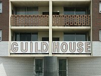
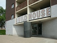
Balcony railings of perforated metal and a brazen commercial sign for this private dwelling |
| |
|
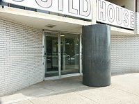
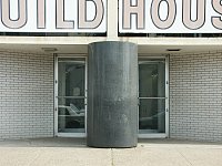
The angled recessed opening and the oversized black granite columnPerhaps the paradox here is that the fat column appears to be supporting the large windowed section above it, terminating in the flat arched window. This bay is set rather awkwardly atop the column as well. Additionally, this monumental central column blocks the entrance--clearly not the way to signal a passageway. Note that in other works by this firm columns, both in terms of style and size, play an important role.
|
|
|
|


 Go to the Venturi Scott Brown Index.
 Click here to return to index of art historical sites.
 Click here to return to index of artists and architects.
 Click here to return to chronological index.
 Click here to see the home page of Bluffton University.

