

 |
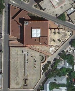
Google map oriented with north at the top |
|
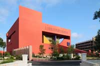
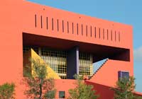
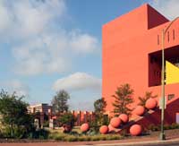
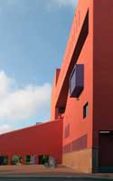
The spectacular east side | ||
|
|
|
|
|
|
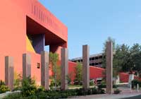
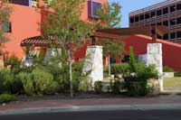
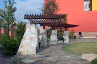
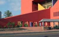
Plaza in front of the east side designed by local landscape architect Chad StranahanBecause the materials of this plaza, added later, are primarily limestone, some critics say it clashes with the original building. The plaza as outdoor reading room seemed popular to patrons when I was there. |
|
|
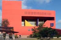
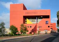
| Note third floor setbacks. These are giant loggia terraces cut into the face of the central cube. The fourth floor, then provides shade for the internal loggia. Unfortunately, today these terraces are off limits to the patrons, left as places for pigeons and detritus. | ||
|
|
|
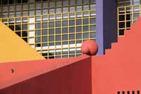
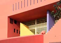
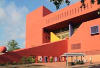
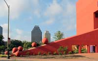
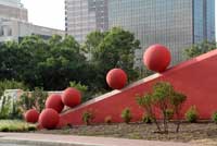
Legorreta's signature geometric shapesSpheres are also common in his work, a kind of logo. See especially his Pershing Square in Los Angeles. | ||
|
|
|
|
|
|
For other works by Legorreta on this site, see this index.
 Click here to return to index of art historical sites.
 Click here to return to index of artists and architects.
 Click here to return to chronological index.
 Click here to see the home page of Bluffton College.

