

SANAA: Kazuyo Sejima and Ryue Nishizawa
2007
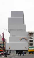
A controversial buildingAlthough the architecture critic I usually find most illuminating calls this building "disappointing" (Huxtable), this has also been said: "this mesmerizing 174-tower on the Bowery demonstrates the power of understatement more convincingly than any Manhattan structure since Ludwig Mies van der Rohe's Seagram Building was completed in 1958" (Filler). Filler also talks about the "exhilarating lightness and unexpected warmth Sejima and Nishizawa bring to minimalism". For a prior example of their work in the United States see, Toledo Glass Pavilion, Toledo Museum of Art. The Toledo building is horizontal, whereas the New Museum is vertical--and the tallest building the firm has built to date. But both have a kind of magical simplicity. This museum was built for the relatively small budget of $50 million. | ||
|
The Bowery siteAlthough the "New Museum" has existed as entity since its founding in 1977, it never had a building until recently. Now it has a clearer identity in part because of this building, designed by the 2010 Pritzker-prize winning architectural team. While cost constraints contributed to its style, the museum directors also wanted a building that would relate to its surroundings--the Bowery (now in the process of changing, however) and at the same time signal the kinds of art the museum promoted--cutting edge, innovative works. They indicated that they wanted a striking, surprising building but one made of "vernacular materials, materials part of everyday life in keeping with the Bowery neighborhood, both scrappy and stylish" (Phillips in Shift 7). It was built on a former parking lot and is sandwiched in between the older buildings. The tiny lot is 71 feet wide and 112 feet deep and the museum is relatively small--60,000 square feet. Still, the building seems monumental. |
|
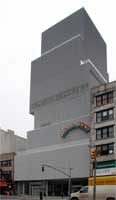
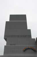
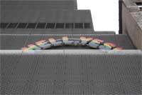
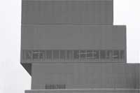
A dramatic stack of boxesThe boxes are set unevenly so that narrow skylights could be created along the outer edges of some of the galleries. Their position varies from floor to floor. In addition, every floor is a different height and size. |

|
|
|
|
|

|
|
|
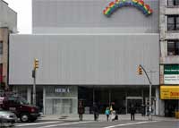
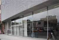
The 15 foot tall glass storefront facadeFrom a distance the building seems to float above the sidewalk. The Museum is also inviting since only this thin sheet of glass, stretching across the entire front, separates the outside from the museum's lobby. | ||
|
|

|
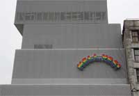
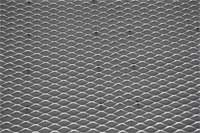
The mesh facadeNishizawa says "The use of mesh was inspired by our desire to acknowledge the 'texture' of the surroundings and maybe as Sejima said, the nature of the New Museum. Mesh is the most common industrial material. Our objective was to use it in a subtler, more poetic way without sacrificing its qualities. For this reason we decided to use an aluminum mesh instead of the more common steel variety. Aluminum gives a very different impression--it's bright and white and translucent. It gives the building a totally different feeling of lightness, subtlety, and permeability" (interview by Grima in Shift 28). The building, of course, has a double facade with a mesh skin 3 inches in front of the outer wall, which gives the building a kind of transparency. Nishizawa believes that the sense of transparency made possible an essentially windowless facade--"without seeming heavy" (interview by Grima in Shift 25). |
| |
|
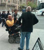
Looking out to the sidewalk: Mary Ann Sullivan talking to Chuck CloseHere the intrepid photographer and art historian does something she has never done before: she "accosts" a celebrity--the internationally known painter CHUCK CLOSE. Of course, living in backwater Ohio she never sees a celebrity and then she has admired Close's works since she was blown away seeing his huge portrait of Philip Glass in the Whitney many years ago. (It's hard to understand scale from pictures in books.) Chuck Close was gracious while she babbled on like an idiot. He is a patron, supporter, and apparently a frequent visitor to this exciting museum. (Unbeknownst to her, Mary Ann's friend Leslie Rigali, with whom she was visiting New York City, took this photograph through the window.) |
|
 Click here to return to index of art historical sites.
 Click here to return to index of artists and architects.
 Click here to return to chronological index.
 Click here to see the home page of Bluffton University.

