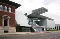
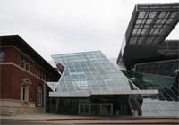
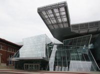
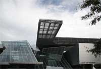
The old and new According to Wolf Prix, one of the founders of Coop Himmelb(l)au, "The new building wraps, penetrates and reorganizes the existing building. History is not destroyed or forgotten, but intelligently folded into the future" (official pamphlet). The entrance ("the Crystal") leans toward the old building (see below) and the cantilevered high roof shelters it. Part of the south facade of the older building was removed so that the two buildings could be internally connected. (See views of the interior.) The new addition faces west.
|
|
| |
|
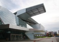
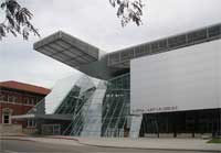
The Crystal--an asymmetrical grand entranceThis tall glass structure (57 feet high) covers the lobby. The architects see their design as an "urban connector" so this open transparent lobby should be viewed as a continuation of the outdoors--even the floor is concrete like the outside sidewalk.
|
|
|
|
| |
|
|
|
|
| |
|
|
|
"sculpture out of frozen air"Here is a quote from Wolf Prix stating his goals for his architecture. |
| |
|
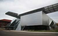
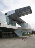
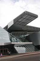
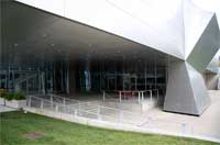
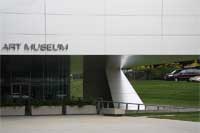
Side entrance under the Gallery Box--southwest cornerThe windowless gallery space above is cantilevered, leaving a roofed piazza below. |
|
|


 Go to Akron Art Museum Index.
 Click here to return to index of art historical sites.
 Click here to return to index of artists and architects.
 Click here to return to chronological index.
 Click here to see the home page of Bluffton University.

