A low profile pavilion |
|
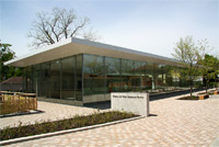
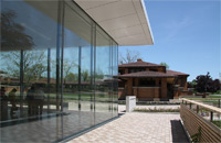
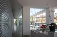
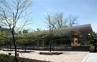
This visitors' center for the Martin House complex was the winner of a design competition sponsored by the Martin House Restoration Corporation (MHRC). This group selected five emerging architects for the competition, just as Wright himself had been selected by Martin as a promising but essentially untried architect to design his house in the first decade of the 20th century. Like Martin, the committee hoped that by taking this risk, the result would be something important and original. The design challenge was immense: not only to respect the scale of the neighborhood (the prestigious Parkside East community) but to design an original building that was yet respectful of the Wright complex next to it. The winning design is by Toshiko Mori, principal of Toshiko Mori Architect in New York City and former Dean of the Department of Architecture at Harvard University Graduate School of Design; initial reviews have commented on the elegance and deceptive simplicity of this smallish building (7775 square feet) and its poetic response to Wright's complex. The openness and connection to the landscape are obvious connections with its predecessor but less obvious is the reverse hip roof, recalling Wright's typical hip roof with flat roof overhangs, and the fact that the pavilion reflects the spacing of the columns in the pergola opposite it. The differences are also telling. While the buildings in Wright's complex are imposing masonry buildings, Mori's pavilion is transparent and glass-walled, integrating the landscape and providing a dramatic view of the Martin complex. |
| |
|
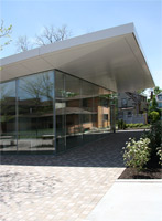
An inverted hip roofOf the roof, Mori says," [it is] an inverted hip roof supported by four centralized piers recalling the piers present in both the Martin House and the Larkin Building. . . . The building perimeter is supported by thin vertical stainless steel mullions that are integrated into a glazing system, thus giving the impression of a floating canopy" (Kleinman 57). The design program restricted the square footage of the building and the height (to 26 feet). Mori explains that her firm placed as much of the program below grade as possible and emphasized the horizontality of the structure; it reaches 17 feet at it peak (Kleinman 56).The main floor is heated and cooled by convection from systems below the ground. |
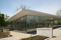
Front entranceA paved courtyard separates this entrance from the complex designed by Wright. These photographs were taken about two months after the opening so the landscaping by Quennell Rothschild and Partners may not be complete. Newly planted locusts can be seen below, however, along the perimeter of the courtyard. |
|
|
| |
|
|
|
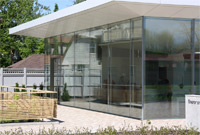
Details of the front entrance--outside and inside |
| |
|
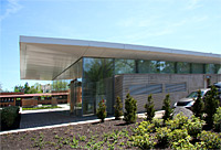
Rear entrance (entrance from the Carriage House)A press release from the Martin House suggests that the inverted hip roof contrasts with Wright's Martin House because his hip roof was protective and sheltering while here the roof turns upward in a gesture of welcome to the public. |
|
|
| |
|
|
|
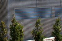
The opaque rearHere on the back side Mori references Wright's use of elongated Roman bricks. The wall is concrete cast to suggest Wright's masonry units. |


 Click here to return to index of art historical sites.
 Click here to return to index of artists and architects.
 Click here to return to chronological index.
 Click here to see the home page of Bluffton University.

