

 |
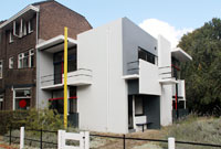
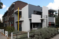
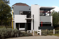
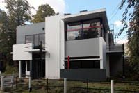
View from the southThis innovative house was built against the end of a row of traditional houses at the outer edge of town; originally it had an unbroken view of the landscape. The plan was a collaboration with Mrs. Truus Schröder-Schräder who commissioned Rietveld, thus allowing him to translate his spatial experiments with furniture into experiments with architecture. The house was designed at her insistence to create a connection between inside and outside. See window design below. "Rietveld began designing the exterior aided by small models and sketches. The facades developed from a painted rectangular box into a collage of planes and lines whose components are purposely detached from, and seem to glide past, one another. Like Rietveld's celebrated red and blue chair, each component has its own form, position and color. The colors were so chosen as to strengthen the plasticity of the facades; surfaces in white and various shades of grey, with black window and door frames, and a number of linear elements in primary colors" (Groenendijk, Vollaard 161). The outside of the house, like his Berlin chair, is an asymmetrical structure with alternating horizontal and vertical planes. The flat roof was also unusual for the time period. |
|
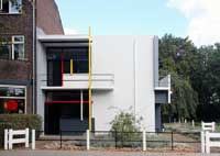
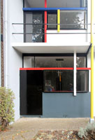
Southwest facadeThe three facades each have openings to the outside. The main entrance facade, however, is around the corner, the southeast facade. The door enters directly into an entrance hall with stairwell. See plan. | ||
 |
 |
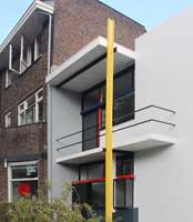 |
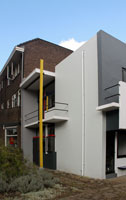
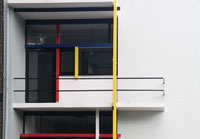
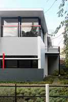
Details of the southwest facadeThe house is generally characterized as an example of "de stijl" architecture, although Rietveld himself never endorsed the claim. This facade with the linear emphasis and use of primary colors makes that case. | ||
 |
 |
 |
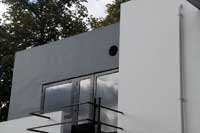
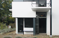
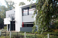
Southeast facadeThis is the main entrance facade. See plan. | ||
 |
 |
 |
 |
 |
 |
Southeast facadeThe interior was also unusual. The main living area, like the piano nobile in an Italian palazzo, is on the upper floor with the living room and dining room on this level. The walls of the rooms are actually sliding partitions so one large open living area could be achieved. See plan. |
 |
 |
 |
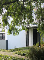 |
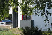
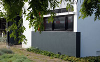
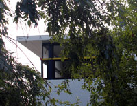
Looking toward the back or northeast facadeThis area of the site is overgrown with trees and plants. |
| The window at his northeast corner of the upstairs (where the living room was located) have no window frames at the corner. Thus interior and exterior seem to flow into each other. See also Wright's Kaufmann House for a similar solution. | 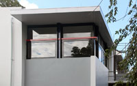 |
 |
 Click here to return to index of art historical sites.
 Click here to return to index of artists and architects.
 Click here to return to chronological index.
 Click here to see the home page of Bluffton University.
