 |
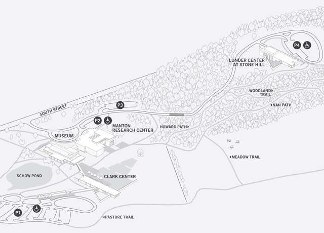
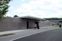
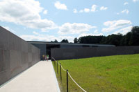
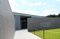
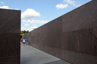
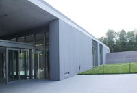
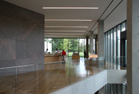
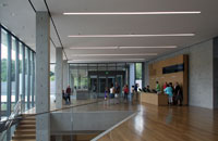
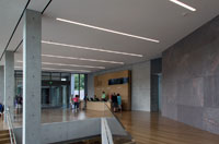
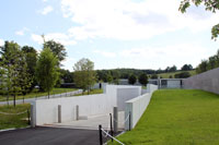
The latest addition to the Clark Art Institute--a Visitor's Center (lower left of campus map [from Clark's website])Like Stone Hill Center, this newest part of the campus was designed by Pritzker prize-winning architect Tadao Ando. It not only creates a new entrance to the original building but adds gallery space and a multi-purpose pavilion for conferences. The two-story glass, granite and concrete structure looks over a three-tiered pool of water, which Ando designed with Reed Hilderbrand. This use of water and landscaping to connect inner and outer spaces was also seen in Ando's Modern Art Museum of Fort Worth.This new addition, the last in the planned expansion is much praised. These comments by Tim McKeough, writing in the Architectural Digest, are typical: "For a much-anticipated museum expansion by a Pritzker Prize-winning Japanese architect, Tadao Ando's design for a new wing of the Sterling and Francine Clark Art Institute in Williamstown, Massachusetts, may appear surprisingly reserved. Standing just one story above grade, and hemmed in by monolithic concrete and red granite walls, it doesn't reveal itself until you step inside. Pass through the entrance, however, and the building opens up with glass walls overlooking a three-tiered reflecting pool and long views to a rolling, bucolic landscape. . . . Long a destination for in-the-know art lovers searching for a mix of natural and artist-made beauty, the Clark is now more enticing than ever."
The museum's 140-acre campus is in the scenic Berkshire Mountains. The original building, opened in 1955, is a white marble classical structure by architect Daniel Perry ((center left of campus map); in 1973, a red granite building (called now Manton Research Center) by Pietro Belluschi in Brutalist style was added. The two latest additions--Stone Hill Center (top right of campus map) and the Vistor's Center are minimalist in style.
|



 Click here to return to index of art historical sites.
 Click here to return to index of artists and architects.
 Click here to return to chronological index.
 Click here to see the home page of Bluffton University.

